In the crowdy “calli” of San Polo district, in between the well-known Rizzardini bakery and the luxurious hotel Aman, there is a flat entirely designed by Ettore Sottsass, a hidden gem in Venice that we had the honor to visit.
It was commissioned by another famous designer, Cleto Munari, an important aspect to keep in mind to fully understand and appreciate the beauty of the design. He was looking for a place to stay in Venice, one that could possibly well-suit his need to host his friends. When he found this flat it was love at first sight. He bought it in 1979 and by 1987 it was restored and ready to welcome Cleto and his wife, Valentina.
< Francesca Giubilei sitting on the couch designed by Ettore Sottsass. All photo credits go to VDB, except where otherwise stated.
The flat is situated in a seventeenth century palace and one can easily tell by looking at the exposed ceiling beams of the living room, since it was the portego of the building. Like in many other similar cases in Venetian palaces, it was sectioned, and now part of the portego belongs to the adjacent flat.


^ Ph. Emma Gleason, via Pinterest


Visiting the flat was a unique experience. At the entrance the monumental Totem rises above the living room. There was a very obvious problem with this area, because there was no intimate space to receive guests, but just one big living room. In order to create a smaller space, Sottsass designed the Totem, a multifunctional piece of furniture. It is a library and a mini bar on one side and a coat hanger on the other. There is also a small table on the left with an extensive halogen lamp and on the top of the totem there are four umbrella-shaped dimmable lamps which light up the room with pinkish tones.

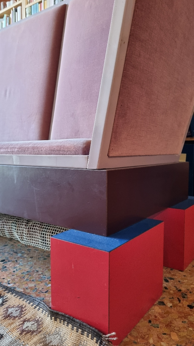
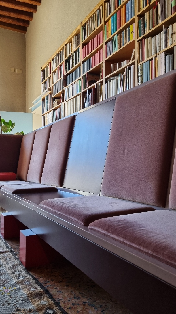
Then we find the Biedermeier, a pinkish couch resembling the benches of the waiting rooms of the train stations, and three refined small tables shaped as columns, the iconic signature of Sottsass. On the other side of the room a big window allows the sunbeams to come through and delicately illuminate the furniture.
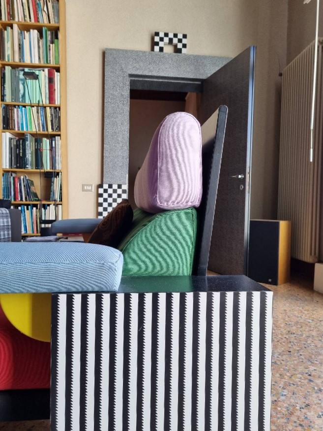
On the sides of the room there are two big libraries designed in Carlo Scarpa’s style which host the collection of books of the actual owner, Professor Perocco. She welcomed us warmly and invited us to take a seat on the L-shape couch Persona, designed by Zanotta. While drinking some coffee, she confided to us that Munari was not very happy at first with the libraries because in his opinion she would have ruined the design of the flat, but he changed his mind when she set them up.


The original apartment owned by Cleto Munari, via Pinterest
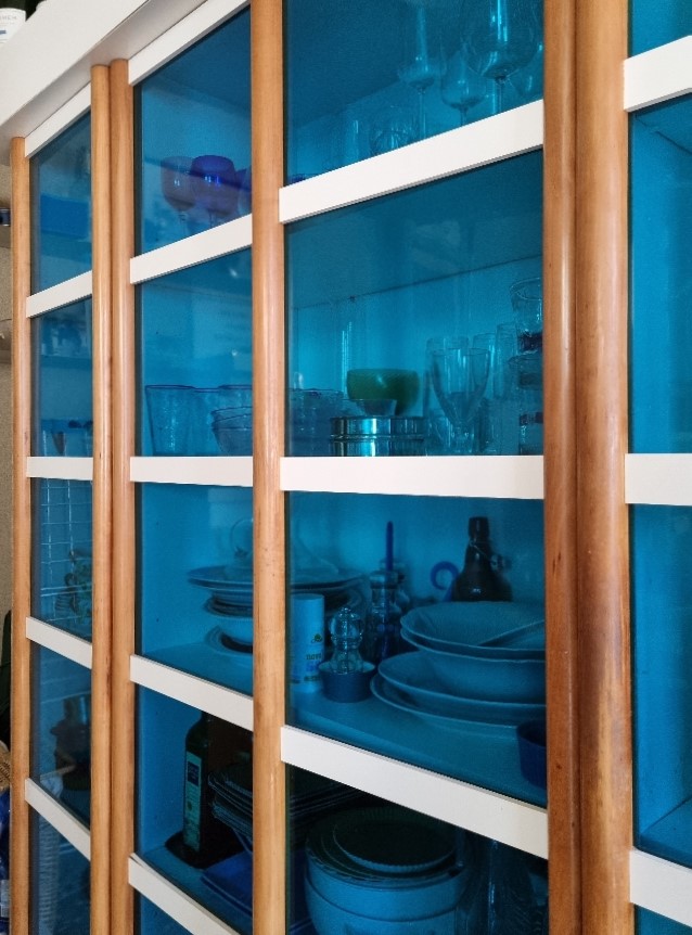
Materials play an important role in the flat. On the Totem are displayed precious glass vases (mostly by Venini), collected and selected with care by the owner. These objects are the only rounded shapes in the house, while the design of the furniture is rather linear and essential. It is fundamental to notice that the wood chosen by Sottsass is pear wood, the same kind used by Venetian glass makers to better mold the glass.
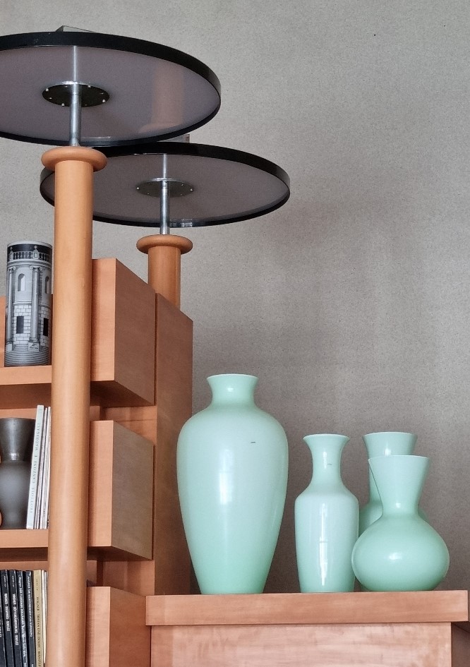
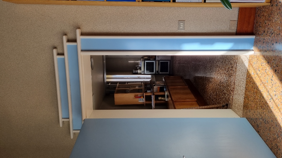
The living room is connected with the other rooms by 3 doors, each one with a particular design. The door of the kitchen is light blue and resembles an oriental shrine, the dining room one has a chess motif on the jamb and lastly the one that connects with the hallway is made in briar root wood. Each one is different in order to emphasize the passage from one space to another.
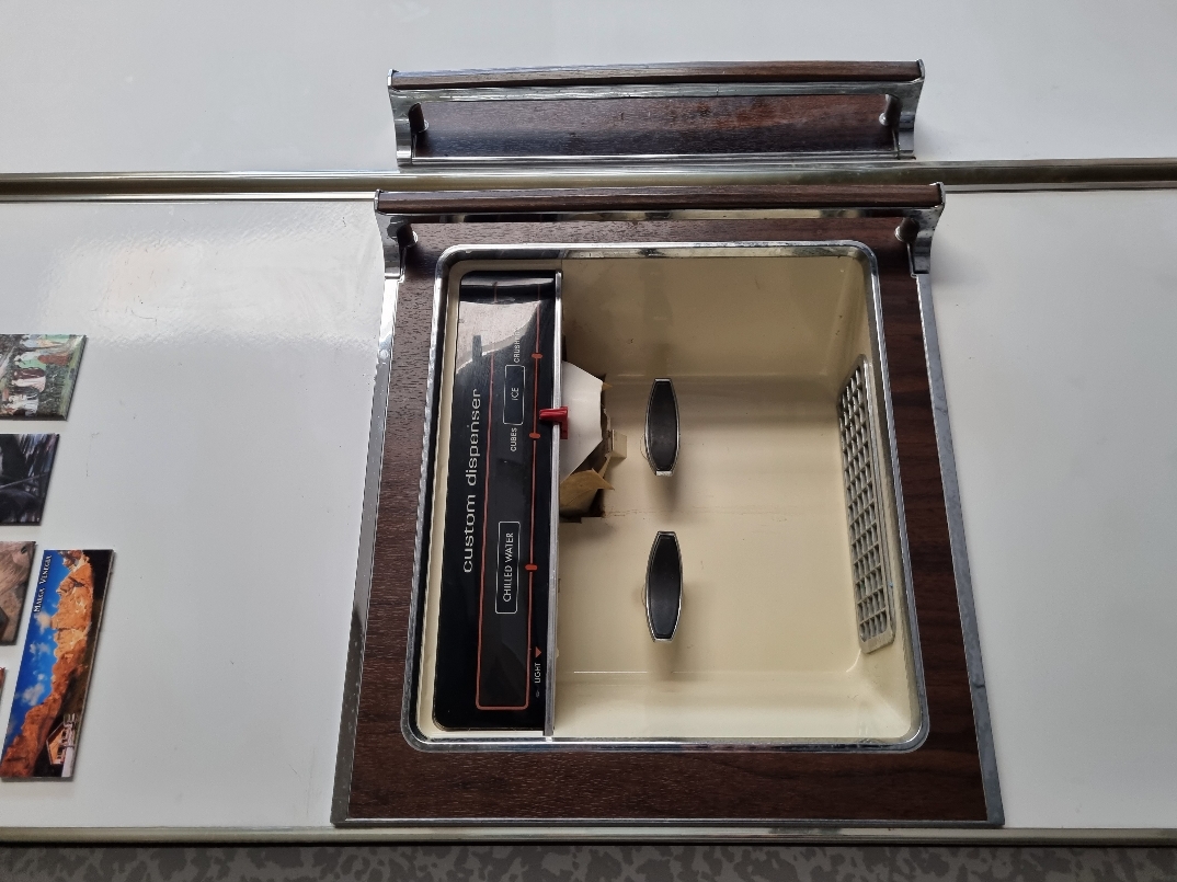
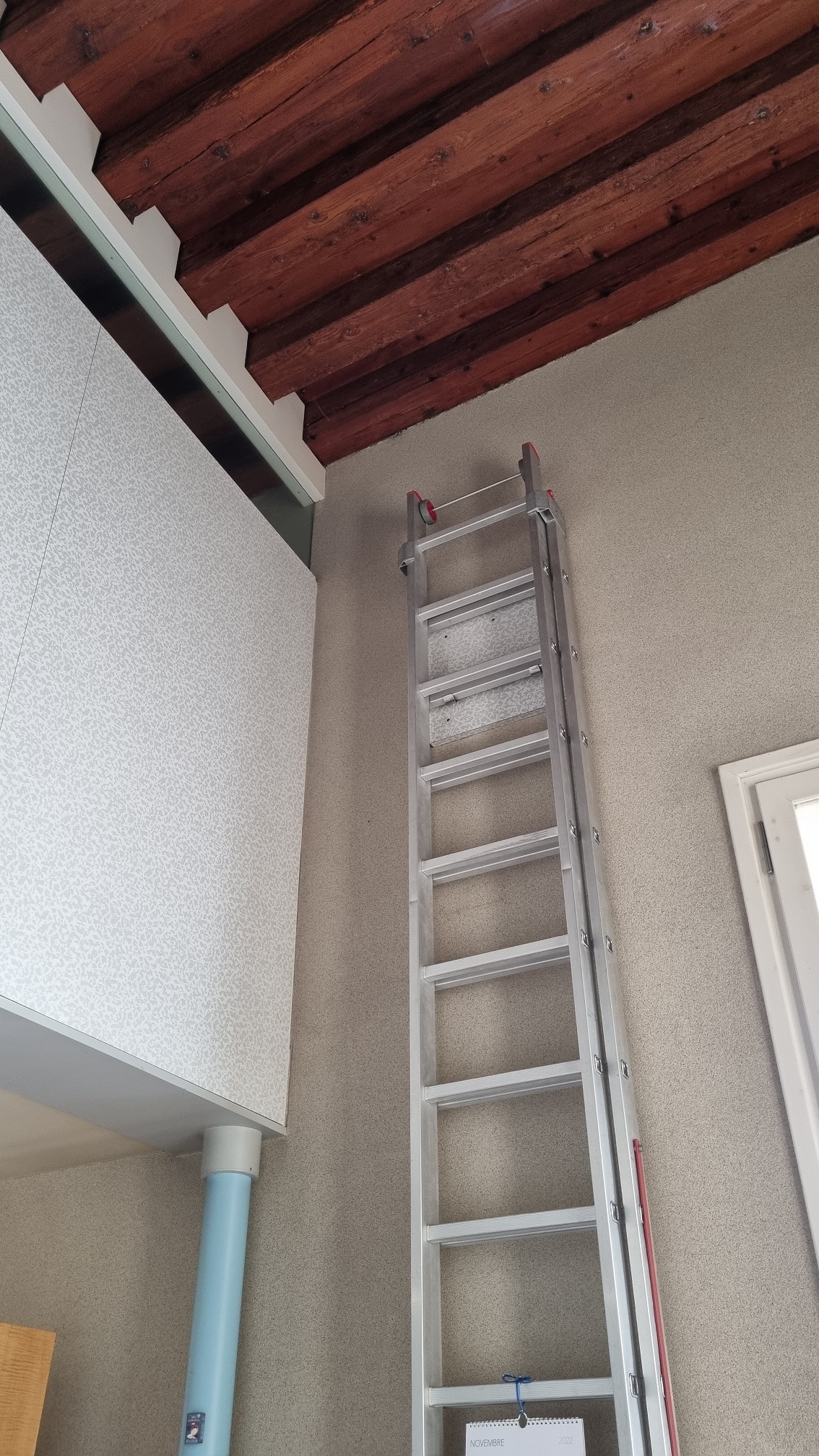
The kitchen consists of two spaces: one for cooking and one for eating and they are separated by a big American fridge and some thin columns. There is also a little mezzanine where the housekeeper could sleep. The chairs around the table are the EMECO Navy Chairs, commissioned by the US Navy in 1944 for warships and then used also in come submarines and Sottsass really appreciated them. The finishing of furniture has an abstract pattern on laminate.

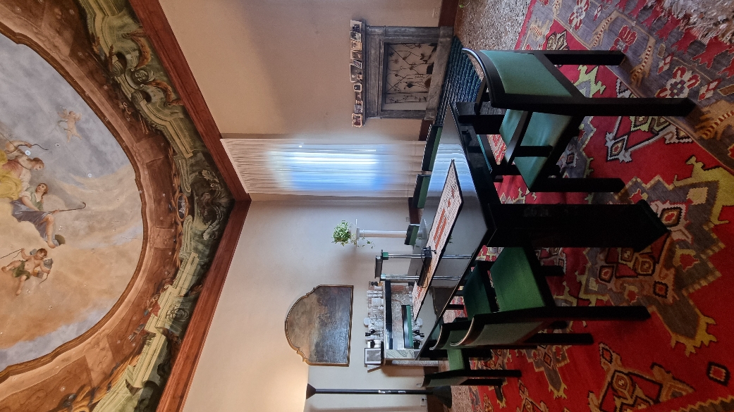
The dining hall is where modernity and contemporaneity blend together the best. On the ceiling is still possible to admire an old fresco and upon two marble tables on the sides of the room there are two renaissance paintings. These are illuminated by two black lamps by Sottsass, which provide of a handle to move them and direct the light in the wanted position. The piece of furniture that looks like a staircase is designed by Sottsass as well. This one in particular is site specific because it’s built in, so that there is more depth that one can imagine. The chairs are designed by Aldo Rossi.
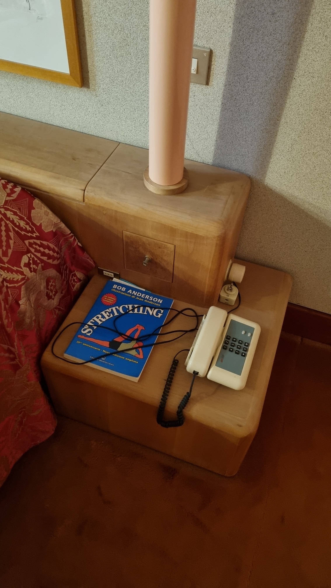
Moving forward there is an L shaped aisle in warm tones. The moquette is brown and the closets are pink, creating a cozy atmosphere and it leads, in fact, to the most intimate area of the flat: the bedroom and the studio.
The design of the flat was conceived in a time when a new lifestyle began to emerge. New habits were formed, and architecture had to satisfy new needs. Design was then conceived as an architecture inside of an architecture, and the less of fixed structures there were, the better it was. It was essential that the furniture could be arranged depending on the need of the owner.

Moreover, Sottsass travelled a lot, and his design was influenced by distant cultures. Each piece has a particular colour and shape, and they hold a message. For this reason, they must be free to contaminate and encounter with each other. In fact, the furniture in the flat is never in the centre of the room, instead, it is on the sides.
By doing so, they are free to engage in a conversation and the space appear more fluid and freer. This idea was first presented during the exhibition Italy: the new domestic landscape at the MoMA in 1972 with the prototype called “Micro Environment”. In this project he tried to propose a new way to design a home: each room has not a distinctive function, but they are adaptable, depending on the needs of the owner. In this way, people can become more aware of the space they live in and how their presence can affect it.
Ettore Sottsass was born in 1917 in Innsbruck and was the son of the architect Ettore Sottsass Senior. He studied architecture at the Polytechnic University of Turin and in 1947 he opens his first design studio. Sottsass was disappointed by the consumerism and mass production in Italy. He once said: «When I was young, all we ever heard about was functionalism, functionalism, functionalism. It’s not enough. Design should also be sensual and exciting». In fact, in 1980, in Milan he founded the Memphis Group with other famous designers and architects such as Hans Hollein, Arata Isozaki, Andrea Branzi and Michele de Lucchi. Inside the Venetian flat there is in fact an armchair by the latter and a mirror by Maria Sanchez. The name comes from an anecdote about their first meeting.
The record player broke and the song by Bob Dylan Stuck Inside of Mobile with the Memphis Blues Again kept playing in loop. It was a sign of fate: Memphis was the hometown of popstars such as Aretha Franklin and Elvis Presley and the capital city of Egypt. A city which represents a melting pot of old and new, historical and pop. That’s what design was about to them. They could draw from an extended repertoire: from antiquity to pop culture, because design was not something exclusive or a prerogative of the upper class, but it belonged to the people. For this reason, colours are fully saturated and bright, a clear reference to pop art. Moreover, Sottsass was influenced by his trip to India. He was amazed by the intensity of the colours and the way they were used in fashion.
^ Details of the original living room (first picture via improvisedlife.com) and the current one
Since Munari’s flat was one of the latest works by Sottsass, we were able to appreciate the evolution of these thoughts about design and immerse ourselves in this Gesamtkunstwerk, a total work of art. A flat, in which every aspect of life can be aesthetic and magic, because, as Ettore Sottsass said: "design begins where rational processes end and magic begins".
